
2026 Design Trends- Inspirations

Understanding 2026 design trends for small businesses can sharpen your visual identity and keep your marketing feeling current.
AI + Human Co-Creation The trend highlights the powerful synergy between artificial intelligence and human designers. This collaboration unlocks new possibilities, allowing artists to explore innovative ideas and create stunning visuals that push the boundaries of traditional design. Embrace the future of artistry where technology enhances creativity.
Implication: For your campaigns. you might lean into AI for rapid concept generation, then apply your custom artistry or brand voice to refine and elevate.
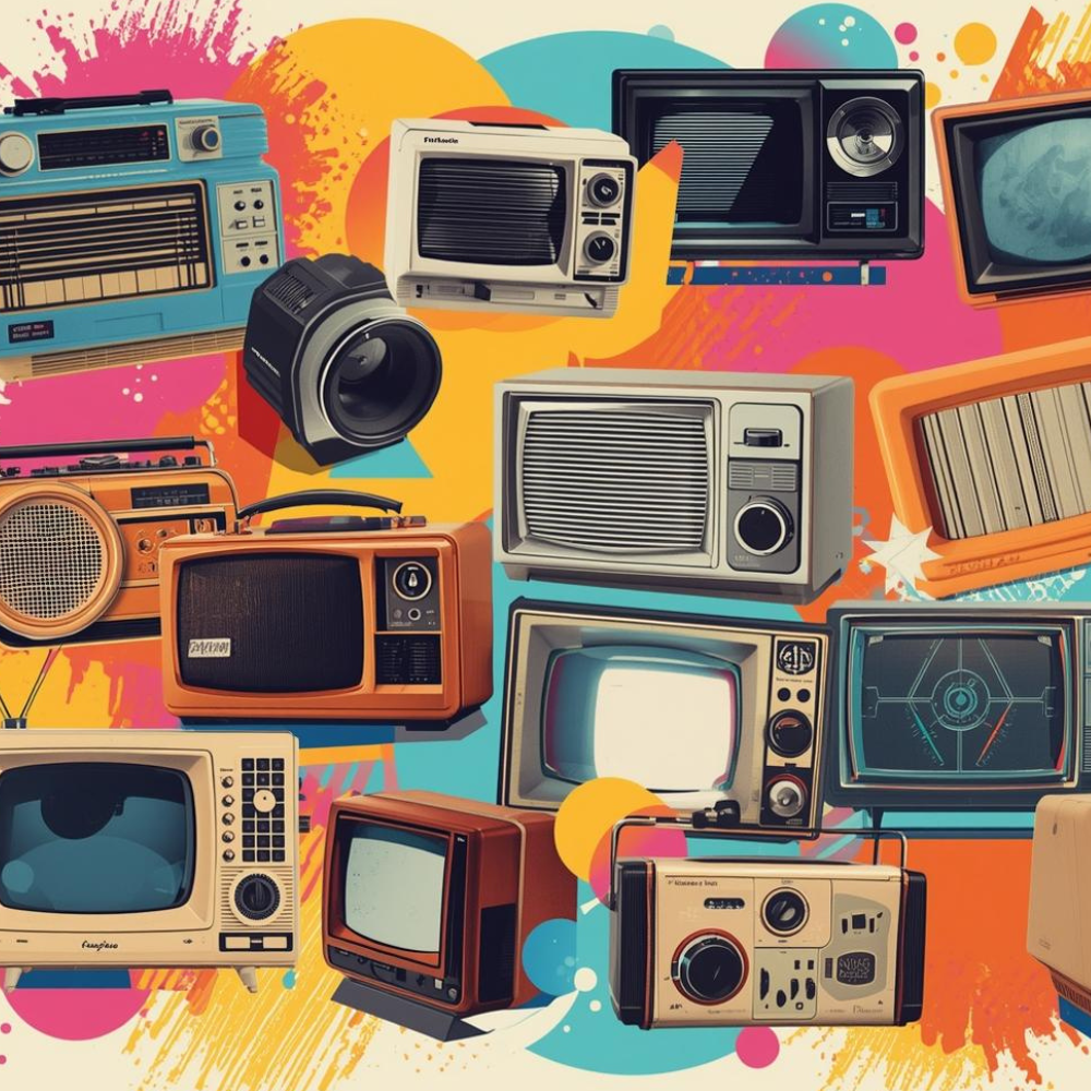
Retro-futurism celebrates nostalgia while embracing cutting-edge technology. This design trend merges vintage aesthetics with modern innovation, creating a unique visual dialogue. Expect to see a resurgence of bold colors, geometric shapes, and nostalgic iconography that inspires creativity and sparks conversation in both print and digital realms.
Implication: If you want to lean into trend-forward or youth-oriented work (e.g., for social campaigns for new product launches), this is a viable palette/style to test — but make sure it aligns with your brand voice and doesn’t feel gimmicky.

Embrace the Flaws - Celebrating Authenticity in Design. The Imperfection Rebellion trend emphasizes the beauty of flaws and embraces a raw aesthetic. Designers are encouraged to create work that feels genuine and unpolished, celebrating unique textures and unexpected combinations. This trend champions authenticity, encouraging audiences to connect with designs on a deeper emotional level.
Implication: For your brand visuals, consider layering in some human-crafted elements (scribbles, sketches, analog textures) to differentiate and make them feel less “template”.

Warm minimalism focuses on creating inviting spaces that prioritize comfort and simplicity. Utilizing a soft color palette and natural materials, this trend fosters a sense of tranquility. The emphasis on clean lines and functional decor allows for a harmonious balance between aesthetics and practicality, reflecting a lifestyle that values clarity and purpose.
Neutrals remain, but warmer neutrals (brown, tan, ochre), rich earthy tones, tactile natural materials and warm minimalism are rising.
Implication: If you’re designing physical marketing/packaging (postcards, prints etc), or even office/brand-space imagery, consider this palette shift: warmer base tones, richer accents, and more materials/textures.